As quoted by Anthony T. Hincks “I celebrate life with a different color each day. That way, each day is different.” Even though we can see and differentiate between millions of hues around us and love it to be colorful, mind it; using all of them on your dashboard can be quite distasteful.
Agreed, finding the right colors that complement each other for Data Visualization is quite difficult but that’s what provides some meaning to your dashboard. If your dashboard isn’t soothing, convincing or attractive to the eyes of your viewers, it becomes extremely easy for them to pin point potential issues and discard your dashboard. Be the dashboard magician by just following these few steps on how to juggle or mix and match the right colors for your dashboard.
Use Colors Purposefully and in Moderation
Too much of both extremes i.e. too much color or very little color is a complete No!
On one hand, too much color will tend to overpower and consume the relevant information you’re trying to convey.
On the other hand, less color tends to make your dashboard extremely dull, which in turn makes your viewers lose interest. Every color in the dashboard should serve a motive. While presenting different elements, try using different colors in the dashboard.
For example, in pie charts, two colors will represent two different concepts.
Firstly, choose the background color for your dashboard carefully.
- Light backgrounds are soothing and provide you with various options for color palettes. It’s easier for users to read text on a lighter background and applying a little white or light space between the visualizations helps viewers differentiate.
- Dark backgrounds are loud and dramatic. They can convey the message if color palettes chosen for them are the correct ones, e.g.: neon colors. But they can be loud or hurtful to one’s vision. Also, studies show that darker backgrounds make it difficult for people to read or concentrate.
- Use saturated colors i.e. the purest version of colors for presenting graph titles or action buttons so users can quickly identify these important elements on the screen.
- Contrasting colors are attention seeking, hence; choose a color for your text that has a clear contrast with your dashboard background color.
Adhere to Brand Guidelines
If your client has brand guidelines in place, try to stick to these guidelines as best as you can. Brand guidelines are often available via the marketing team and will give you the exact RGB or HEX colors which can be used by you on your dashboard adhering to the company’s standard color palette. If your client does not have formal brand guidelines, take your cues from their website and other marketing sources.
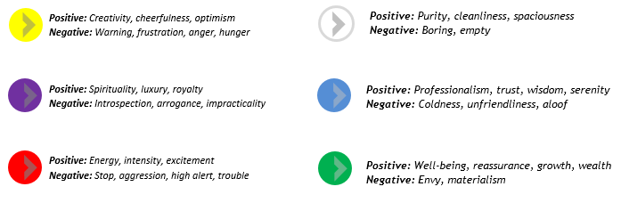
The Psychology of Colors
Like words, colors have their own language and send signals. Take a stoplight, for example. Green means “Go”, Yellow means “Warning”, Red means “Stop”. When applied inaccurately, colors can communicate wrong messages. Colors play a major role in getting your message across—and the right ones can help you decrease the visual elements as per your requirement to convey the exact information.
Red and green usually indicate danger and positive feelings respectively, as well as a financial loss and gain. Red and blue have opposite associations, with red normally being associated with hot and blue with cold. One can use these colors to communicate a meaning with your viewers without using additional labels or pointers. Below is a short list of how common colors are often perceived:
Colors - that complement each-other
Understanding color isn’t a cakewalk and is the most important step to applying it successfully in one’s design. Like anything else, color theory is a complex subject that analyzes how different shades interact with one another. However, a few elementary guidelines can often make a huge difference in finding a perfect palette. While developing your schemes, consider one of the following rules as a general guideline to follow.
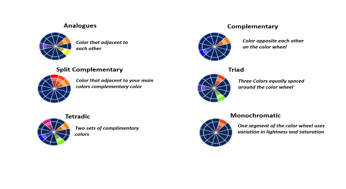
If you are a bit lost, Color Palettes - Color Hex is great place to visit in search for inspiration.
Color: Watch it, comprehend it, explore it, experiment with it and love it!
There are people who specialize in studies of psychology or neuroscience of colors and the color theory. These complex subjects land at an intersection of science and art. This dynamics of science and art is what makes a dashboard effective and communicative.
Through this article we tried to touch the surface, we hope that we helped you understand and informed you of the effectiveness of the color choices which you would need to make to communicate your ideas.
Happy Dashboarding!
 Prev Article


